purdylola draws is where I keep my illustrations and archive the artists who inspire me. You can also find me here at Purdylola Loves for more general musings on art, music and fashion.
Skipping ahead and after a drought of approximately 7 years during which I produced very little art work (why? - working crappy jobs, doing a PGCE, getting my head around being a teacher? or just lazy & uninspired? who knows), anyway suddenly I started making again. Invited by my PGCE tutor Keith to submit work into an exhibition at MMU I made the collages and illustrations below. Now that I am well and truly into my Masters I have no excuse to slack off so I plan to make time and do some creative work every weekend from now on. That's the plan anyway.
Phew, finally made it to the last of my degree posts. It's been rather nerve wracking revisiting work that is almost a decade old as I can't help but see the dozens of details that I would change if I was to do it all over again. Still, I suppose it's been quite useful too. I remember leaving the course wondering whether Graphics had been the right choice especially as it seemed almost impossible to find work in the industry but considering I still choose to work with image and text now, well I guess it was. This project was in response to a brief I wrote myself which once again tackled issues that concerned women. The interior of the doll's house which was specially built was filled with political feminist graphics, furniture and cut outs of Barbie and Ken dolls from the 50s. I then photographed the piece and made them into a set of postcards. This is definitely one of those pieces that I see now and cringe a little as it all feels a bit clichéd and naive. Anyhoo, you live and learn.
Another project from my Graphic Arts degree (1999-2002). At the time I was really into digging up graphics produced by women during the Women's Liberation movement of the 60s and 70s and had amassed quite a collection. My favourite finds were those that used humour to tackle a serious, complex issue like feminism (like in the excellent examples seen below). The work following (last 4 images) was my response to a publication design brief which required us to produce illustrations for a magazine article which documented a political issue or cause of our choice. I came up with the name 'Graphics for Grrrls' and then presented a selection of the posters and cartoons onto swatches of retro fabric from the same era. Most of the work was produced by hand although this was also one of the first times I flirted with Photoshop.
Illustrations for a slightly warped version of Little Red Riding Hood produced during my degree. The background was actually an A1 sized painting that I produced then photographed with a foreground of cotton wool, hardened PVA and glitter. If I remember rightly the armatures for the puppets were lollipop sticks, very Blue Peter!
I really was in two minds whether to post about this project. Although I still think the concept behind it is interesting and thought-provoking I have always been disappointed about how it turned out aesthetically. The idea was to create a piece that dealt with the responsibilities inflicted on modern day women such as housework and childcare but represent this metaphorically through the medium of a contraceptive pill packet. The idea being that by taking an 'Onus' pill a woman was taking on a fresh dose of responsibility; each pill was illustrated with a different symbol representing a variety of stereotypical female oriented objects eg a hoover or a lipstick. The accompanying booklet offered guidance such as: 'Your medicine works as a reminder of your gender and your duty' 'The active substance is responsibility' 'POSSIBLE SIDE EFFECTS: In most cases patients will experience depression and feelings of suffocation' I remember it was lots of fun writing the booklet as it was definitely meant to be quite tongue-in-cheek. I also remember struggling for weeks to get hold of the right materials to make the packaging look convincing, especially the foil covering and failing at every turn. Still, a memorable experience for me and for my tutors who were all blokes and really rather baffled by it all.
This project named 'Fruit Flower' was also produced while on my Graphics degree. I can't remember now whether this was in response to a specific brief or one we had to generate ourselves. I think probably the latter as the subject matter is of a very personal nature. The final piece consisted of a handmade book and matching presentation box. The idea was that this was the packaging design for a limited edition compilation album featuring songs by Nirvana, Hole and PJ Harvey. At the time I was really interested in gender politics and was in the throes of writing my dissertation about representations of women in music with a particular focus on the Riot Grrrl movement. When selecting the tracks that would feature on the album I chose ones that made reference to issues relating specifically to women such as body image, abortion and domestic violence. The art work was then produced in response to these lyrics. I remember that I wanted to use lots of tactile materials, use stereotypical female techniques (stitch etc) and lots of womb-like red, all a bit clichéd in hindsight! Mind you that is still one killer tracklist.
After a year studying Fashion and Textiles at Liverpool John Moores University and being more confused than ever about what kind of artist I was or ever wanted to be, I eventually found my way onto the second year of Graphic Arts also at John Moores. I approached the course with great enthusiasm and particularly enjoyed the challenges and boundaries of working to a brief, something that I still need now to be able to motivate myself. The images below were created in response to a brief that asked us to document and promote an area that was familiar to us (or something like that, it was some time ago). I chose the Northern Quarter in my home town of Manchester celebrating in particular the recent boom the area had experienced as galleries, cafes, streetwear shops and boutiques had moved in, but also referencing its historical roots and former glory as Manchester's shopping centre.
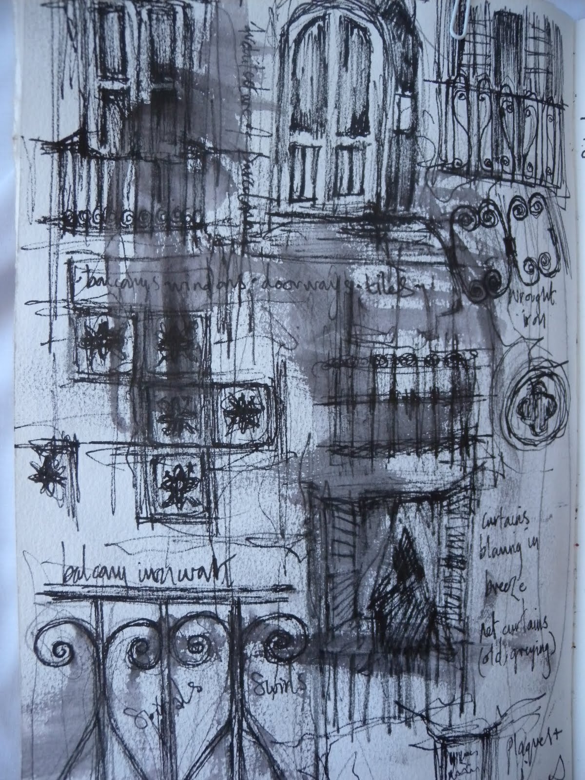
I've been digging around some of my old portfolios for examples of work produced during my Foundation course. Unfortunately I didn't really like what I found as Foundation was rather a weird phase for me creatively. I think this was partly due to the fact that we were asked to make a decision as to whether we saw ourselves as a fine artist or graphic designer, unfortunately at the tender age of 18, I didn't have a clue. As I was really getting into conceptual art at the time I opted for fine art. Interestingly the main difference it seemed between the two groups other than being given different briefs to work towards, was that the graphic artists spent most of their time working in the studio and the fine artists spent most of their time in the pub talking about working in the studio. As you can imagine, my work was a bit thin on the ground. I do however remember a particularly inspirational and creatively fruitful trip to Barcelona where I produced the sketchbook seen below. This trip was the first of many foreign visits I have made over the years both as a student and teacher of art.
In an attempt to really reflect on my creative practice I decided (with trepidation) to go back to the beginning and dig out some of my A level sketchbooks to remind myself of the kind of artist I used to be (approximately 13 years ago!) Below are a few images from one of my sketchbooks relating to a project on decaying buildings. I can distinctly remember taking the initial photos, mainly around Salford and Manchester's Northern Quarter but also while in Venice. Most of my work at the time responded to architecture and tended to remain within a colour palette of sepia, terracotta, inky blue, emerald and black. My work was very much about surface texture and layering and I recall using oils a lot, something I haven't done for a really long time.
Illustrator/Teacher. My very favourite things to do are drawing, collaging, screen printing, going to gigs, writing stories, routing around flea markets, playing bass guitar and listening to all kinds of noise.