purdylola draws is where I keep my illustrations and archive the artists who inspire me. You can also find me here at Purdylola Loves for more general musings on art, music and fashion.

Monday 13 December 2010

Rub the Sleep Out New Year Party

Another poster commission for the Rub the Sleep Out night at Big Hands, this time to advertise their New Years Eve Party. This was definitely a bit of a tricky brief as there seemed to be quite a few things going on. Not only did it need to refer to the usual Rub the Sleep Out night that the regulars would recognise but it was also being temporarily re-named Rub the Xerox Out to honour the guest - Dj Xerox. It doesn't end there, there was also a drag party theme going on at the same time. Initially I must have come up with around five different designs before realising that I was possibly over-thinking it a bit and needed to simplify things somewhat. I decided that the drag theme could be represented by showing my original Rub the Sleep 'boy and girl' but have their jackets so that the boy was wearing a pink one and the girl a blue.

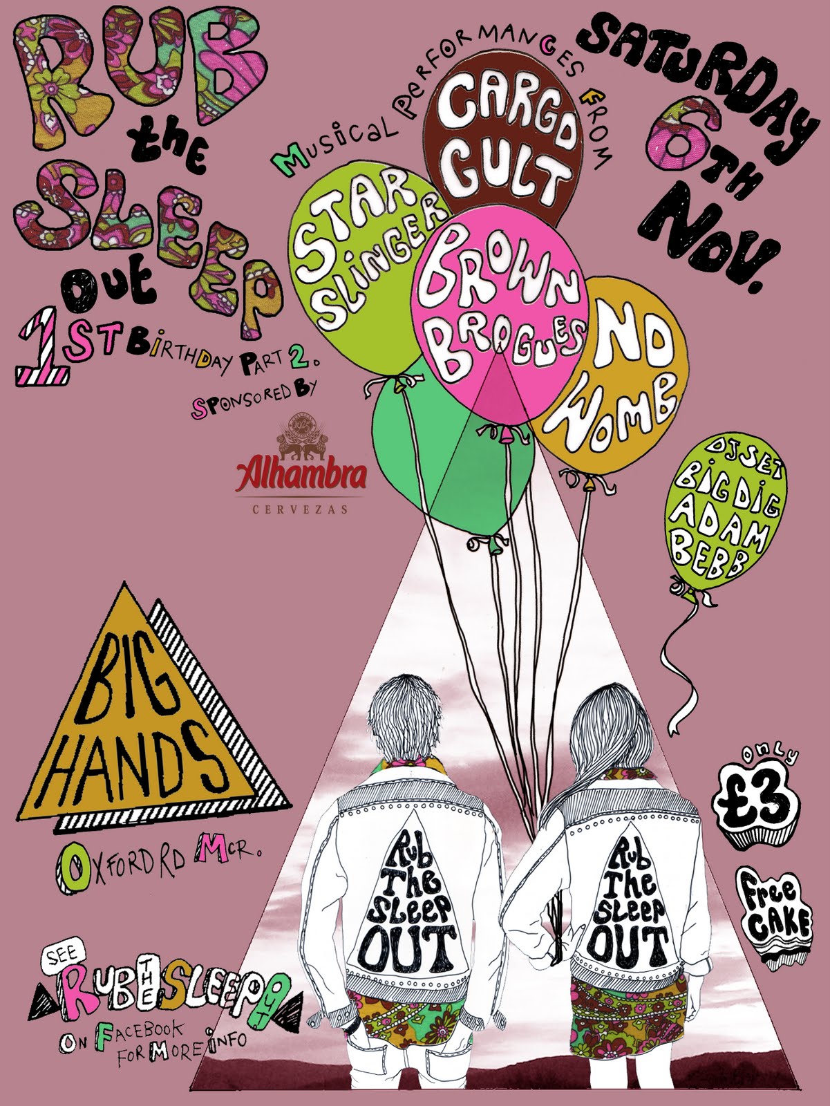
First version (below).


Final version (below). Hopefully I got everything in there. The now hopefully very recognisable Rub the Sleep 'boy and girl' characters, the usual paisley fabric and the Xerox reference using a new contrasting font so that it stands out as a change to the usual line-up.


Sunday 21 November 2010

Beach House

This is the poster I made to commemorate the Beach House gig at Manchester Cathedral. It was an incredible show in a truly stunning setting so it only seemed right to use one of my photographs and to let the incredible scene speak for itself. The glowing cones that rose up behind Victoria, Alex & co. lighting the smoke as it drifted up into the gothic arches was a sight that I hope to never forget. Hopefully with a bit of tweeking on Photoshop and some simple text I have managed to capture that ethereal scene.

Original Photograph (below).


Final poster (below).


Monday 25 October 2010

Rub the sleep Out Birthday Bash

The boys at Rub the Sleep Out approached me again, this time they wanted a poster advertising their 1st birthday party. There are going to be four bands playing on the night so each band needed to appear on the poster. I decided to include my Rub the Sleep 'boy and girl' in the poster as this should help to attract the regulars who may recognise them from the main poster. The balloons seemed like an obvious choice given the celebratory tone of the night and gave me four convenient spaces to fit the names of the bands into.

First attempt at a design for the poster (below).


Detail of the balloons (below).

Final poster (below). I included the paisley fabric which also features in the main poster, again to keep some consistency and make sure that attendees recognise any future posters. The lilacy-plum colour in the background acted as a good base for the other brighter colours to stand out from.


You can read more about the event on Last FM here.

Tuesday 12 October 2010

Mark Lanegan

Below is my Mark Lanegan poster in various stages of completion. Although I don't normally like to use found images of the musicians I've been making posters about I couldn't resist this photo as I knew it would make a fantastic drawing. It also really captures the utter coolness of this giant of a man.

Original photo (below) found somewhere on the net? Unfortunately I can't seem to find it anymore to link back, apologies to the photographer.


Drawing (below) made from the photograph. When working from a photo I try to work quite expressively and don't attempt to draw every part allowing for some negative space. This also helps as it allows some room for the all important text.


Drawing with some parts of the original photo collaged back into the drawing to provide some contrast (below).


Finished poster with textured layer in background to add 'grunge' (below).


Monday 6 September 2010

Chew the Float Private View

I've been working at a slightly insane rate recently, what with teaching, writing essays for my Masters, poster commissions and making my work for the 'Chew the Float' exhibition at Victoria Baths. Thankfully I am starting to see the light and everything is finally coming together. Below are some photos of the exhibition including my entry which is a length of wooden bunting which reads 'Not Waving But Drowning'. The statement that went with my piece went as so:

'Victoria Baths inspired me to create something that recalled childhood memories of swimming at my own local baths in Salford. Unsurprisingly my most vivid memory is when I came close to drowning at the age of 7. Waving cockily to my Mum before diving into the deep end I found myself entangled in my rubber ring, trapped underwater, gasping for air. Luckily Mum was able to translate my SOS and saved me from a watery end. However, the experience left me with an overwhelming fear of water for many years.
'Not Waving but Drowning', a reference to the Stevie Smith poem, acts as a sign to both warn and celebrate. The warning goes out to others like my 7-year-old self, giddy with a false sense of invincibility, to take care, but the sign also celebrates overcoming fear to participate in the joys of swimming, an activity that thankfully no longer fills me with the sense of dread I felt as a child.'

My poster greeting visitors on their approach to the baths (below).


A 'hipstamatic' impression of my piece (below) courtesy of Nathan.


In close-up (below).


Some of my very talented friend's work (below).


Emma Baker


Andy Gornall


Rachael Barker


Matt Davies


Tuesday 10 August 2010

Chew the Float


As a member of the Cottonopolis Arts Collective I am going to be showing some of my art work at Victoria Baths in Manchester this September. The baths is an incredible building which houses two original Victorian Swimming Pools that are currently undergoing extensive restoration. The brief is a site specific one and although I am yet to decide what I am going to make for it I have had a more pressing issue to overcome first as the organisers gave me the job of producing a poster advertising the show.

The name of the exhibition is 'Chew the Float' which was inspired by one of the organiser's childhood memories of swimming lessons when he would nervously chew at the float. With this as a strong image to go off and because I have been to the baths many times and have quite a few photos I had plenty to go off.

This photo (below) of one of the changing cubicles that line the edge of the pool stood out as a possible background for the poster. Once I had drawn this I made a sketch of a boy holding a swimming float up in front of his face and positioned him outside of the cubicle. Once I had got this right I set about putting the two together.


First attempt to put together the final poster (below).


Final poster (below) with added 'grunge' so it reflected the rust and peeling paint that gives the baths their nostalgic charm. The font was also selected for it's old fashioned quality.


Tuesday 20 July 2010

Rub the Sleep Out


Horray I've had a commission! I have been asked to make posters and flyers for a club night at Big Hands called 'Rub the Sleep Out' (great name). The music is a mixture of retro, new and weird tunes and hosted by two guys Jolan and David. They have given me pretty much free reign on how to approach it, in fact the only condition was that there must be a triangle somewhere as this is their trademark. The results are below.

I started off with the idea of what a typical Rub the Sleep Out-goer might look like, male and female. I was then thinking about how I could incorporate the triangle and imagined them maybe wearing monogrammed shirts until I came up with the idea of them in customised jackets. I made it so that the jacket was tight on the boy and baggy on the girl as though they were wearing the same jacket. Once the outlines were complete I scanned in a swatch of sixties paisley fabric and added that to create a connection between the two.


Previously the posters for the night had been quite surreal or psychedelic so I thought I'd keep to this feel by having the two characters staring out into a triangular sunset. David particularly wanted the text to have a similar feel to that seen on this Flaming Lips album cover. Once it was all put together I added an additional layer in Photoshop that subtly came through to make the poster look a bit more aged and vintage.


Poster in-situ at Big Hands (below)


We have talked about possibly making t-shirts to sell on the night. This is a mock-up of how I envision they may look (below).


Sunday 6 June 2010

Franz Ferdinand


Another poster completed this week, this time for Franz Ferdinand. The idea bizarrely came from the artwork for the Grizzly Bear album Vekatimest or at least the artist who created it William O'Brien. With his work in mind I began playing around with some lino and making rather crude triangle prints on different surfaces. I also wanted the poster to have a kind of Russian Constructivist feel to it as a nod to this Franz Ferdinand album cover. I also had in mind an image of lots of close-up eyeballs, one for each member of the band repeated over and over. Anyway after a few false starts and a bit of experimentation I finally reached a conclusion which sort of has a few of all these elements in it.


First attempt (below) which took me about 20 minutes to make. Speed is never the sign of a good poster so I scrapped it.


Another experiment (below) with lino and collage, making eyelashes for the eyes using the triangles.


Final poster before text and colour adjustments (below)
.


Final poster (below)
.


Friday 4 June 2010

J.Mascis and the Fog


Current poster for J.Mascis and the Fog completed. When I began I had in mind a kind of Wild-West 'Wanted' poster. What I actually ended up with was a bit different but hopefully has a similar feel without being a cliché. Anyway to start with I drew each band member and applied a sepia filter to each one in Photoshop. I used a found image of a picture frame to place each one into and added some handmade text. I liked the idea that there was a bit of a hierarchy within the band, what with J.Mascis being a bit of a legend due to the success of his main band Dinosaur Jr. and with the other members of The Fog regularly changing. I don't know if this really comes through but I'm pretty happy with the results all the same.


Related Posts Plugin for WordPress, Blogger...