purdylola draws is where I keep my illustrations and archive the artists who inspire me. You can also find me here at Purdylola Loves for more general musings on art, music and fashion.

Tuesday, 20 July 2010

Rub the Sleep Out


Horray I've had a commission! I have been asked to make posters and flyers for a club night at Big Hands called 'Rub the Sleep Out' (great name). The music is a mixture of retro, new and weird tunes and hosted by two guys Jolan and David. They have given me pretty much free reign on how to approach it, in fact the only condition was that there must be a triangle somewhere as this is their trademark. The results are below.

I started off with the idea of what a typical Rub the Sleep Out-goer might look like, male and female. I was then thinking about how I could incorporate the triangle and imagined them maybe wearing monogrammed shirts until I came up with the idea of them in customised jackets. I made it so that the jacket was tight on the boy and baggy on the girl as though they were wearing the same jacket. Once the outlines were complete I scanned in a swatch of sixties paisley fabric and added that to create a connection between the two.


Previously the posters for the night had been quite surreal or psychedelic so I thought I'd keep to this feel by having the two characters staring out into a triangular sunset. David particularly wanted the text to have a similar feel to that seen on this Flaming Lips album cover. Once it was all put together I added an additional layer in Photoshop that subtly came through to make the poster look a bit more aged and vintage.


Poster in-situ at Big Hands (below)


We have talked about possibly making t-shirts to sell on the night. This is a mock-up of how I envision they may look (below).


Sunday, 6 June 2010

Franz Ferdinand


Another poster completed this week, this time for Franz Ferdinand. The idea bizarrely came from the artwork for the Grizzly Bear album Vekatimest or at least the artist who created it William O'Brien. With his work in mind I began playing around with some lino and making rather crude triangle prints on different surfaces. I also wanted the poster to have a kind of Russian Constructivist feel to it as a nod to this Franz Ferdinand album cover. I also had in mind an image of lots of close-up eyeballs, one for each member of the band repeated over and over. Anyway after a few false starts and a bit of experimentation I finally reached a conclusion which sort of has a few of all these elements in it.


First attempt (below) which took me about 20 minutes to make. Speed is never the sign of a good poster so I scrapped it.


Another experiment (below) with lino and collage, making eyelashes for the eyes using the triangles.


Final poster before text and colour adjustments (below)
.


Final poster (below)
.


Friday, 4 June 2010

J.Mascis and the Fog


Current poster for J.Mascis and the Fog completed. When I began I had in mind a kind of Wild-West 'Wanted' poster. What I actually ended up with was a bit different but hopefully has a similar feel without being a cliché. Anyway to start with I drew each band member and applied a sepia filter to each one in Photoshop. I used a found image of a picture frame to place each one into and added some handmade text. I liked the idea that there was a bit of a hierarchy within the band, what with J.Mascis being a bit of a legend due to the success of his main band Dinosaur Jr. and with the other members of The Fog regularly changing. I don't know if this really comes through but I'm pretty happy with the results all the same.


Saturday, 29 May 2010

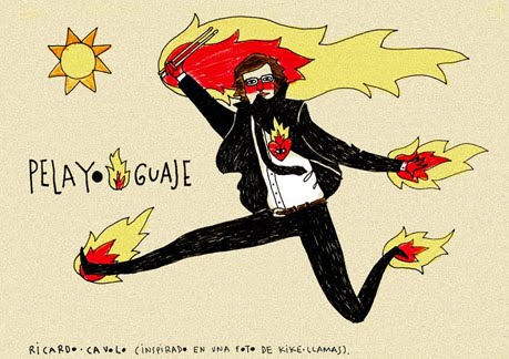
Ricardo Cavolo

Sometimes you discover an artist and you feel a bit sick because they are so good and you think, if I could draw like anyone it would be them. For me Ricardo Cavolo is one of those artists. His creations are totally delightful and seemingly effortless. You just know he's the kind of illustrator who never ever stops doodling, in fact he's probably been sketching these same curious folks since he was a little boy. You can see more at his blog here.


Saturday, 15 May 2010

The Dead Weather

I've recently made a poster for the Dead Weather gig I went to last year. As usual I had a strong theme in mind, particularly in terms of colour which I knew should be a palette of moody greys. They are definitely the most gothic of Jack White's bands and so I wanted to evoke this darkness. I suppose in a way I was rather literally translating the words 'Dead Weather' by using the idea of a traditional weather house but subverting it so that it became more like a haunted house, the sort of place that the band might hang out in. This is actually the first poster where I have had to use a number of techniques to achieve my vision; the band members and text are hand-drawn, the house was made in Illustrator and it was all brought together in Photoshop.

Detail of house and band (below)


Original drawing for Jack and Alison (below). Where have you seen them before?


Close up of hand-drawn text (below)


Finished poster (below)


Tuesday, 11 May 2010

The Cribs

Looking back through my photos from Berlin I found the perfect photograph to turn into a poster for The Cribs. This rather amazing/disgusting public toilet in a squat in central Berlin seemed quite appropriate as a symbol of the kind of raw punk undertones present in their sound. I imagine that as a young band they probably played some real dives and had dressing rooms that were probably just as filthy.


All I really did to the original photograph was change the colours so that they were really saturated and in-your-face then added some text. Simple, my quickest poster yet.


Before


After

Wednesday, 28 April 2010

Grizzly Bear

I've just finished a poster commemorating the Grizzly Bear gig I went to at Manchester Cathedral last November. Originally I was going to use the watercolour (below) that I did based on a photograph of the band members. However, as much as possible I want to avoid using found images as I think it would be more interesting to create totally original responses.


With this in mind I thought about including an image of the cathedral as it's such a unique venue for a rock show so it made for a rather extraordinary gig. I hit on the idea of a grizzly bear climbing the cathedral tower King-Kong style fairly early on but it proved a bit too tricky so I settled for him grabbing onto one of the spires instead. Either way I'm quite happy with the results.

To create the image I used a similar technique to the Yeah Yeah Yeahs poster by using the pen tool in Illustrator to create shapes and build up each component of the poster. I quickly mocked up what I wanted on Photoshop and kept a jpeg in the background as a guideline of where things went in relation to each other. It's probably a bit small to appreciate on here but I tried to add more detail to the bear's face to contrast with the more simplistic shapes elsewhere, hopefully adding character.

Related Posts Plugin for WordPress, Blogger...