Head on over to my other blog Purdylola Loves to read all about how I made this blog header for Ellen Burney of Vagabondiana.
 Head on over to my other blog Purdylola Loves to read all about how I made this blog header for Ellen Burney of Vagabondiana.
  A poster I made for Big Hands for an after-party that actually I don't think ever happened. I was at the Queens gig myself but was so soaked through with sweat after dancing all night the only thing calling me after the gig was a long shower so I never really found out for sure. Anyway the poster was a great brief and I really enjoyed making it AND it became the last of 18 gig posters to feature in my final exhibition, but more on that later.
 Another commission for Big Hands who are throwing an after-gig-shindig for what should be an amazing event at the neighbouring Academy. I was asked to use an original b&w photograph of the band from the 70s but I just couldn't resist making my own drawing of it and using lots of super-trashy colours and prints.
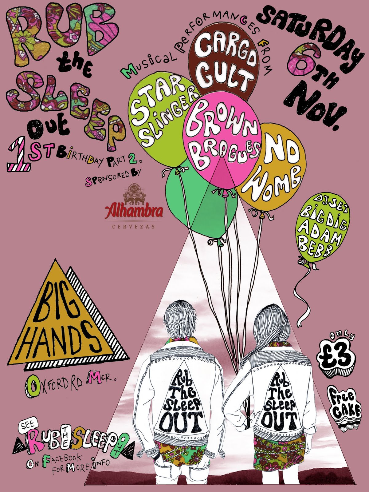
 Final version (below). Hopefully I got everything in there. The now hopefully very recognisable Rub the Sleep 'boy and girl' characters, the usual paisley fabric and the Xerox reference using a new contrasting font so that it stands out as a change to the usual line-up.
 Detail of the balloons (below).
 Final poster (below). I included the paisley fabric which also features in the main poster, again to keep some consistency and make sure that attendees recognise any future posters. The lilacy-plum colour in the background acted as a good base for the other brighter colours to stand out from.
  I've been working at a slightly insane rate recently, what with teaching, writing essays for my Masters, poster commissions and making my work for the 'Chew the Float' exhibition at Victoria Baths. Thankfully I am starting to see the light and everything is finally coming together. Below are some photos of the exhibition including my entry which is a length of wooden bunting which reads 'Not Waving But Drowning'. The statement that went with my piece went as so:


 Emma Baker
 Andy Gornall
 Rachael Barker
 Matt Davies
 First attempt to put together the final poster (below).