purdylola draws is where I keep my illustrations and archive the artists who inspire me. You can also find me here at Purdylola Loves for more general musings on art, music and fashion.

Thursday, 6 January 2011

Gruff Rhys - Work in Progress

After seeing the incredible Gruff Rhys at The Whitworth Art Gallery here in Manchester recently I knew I wanted to make a poster to remember it by. Unfortunately I don't seem to have got much further than making Gruff's rather distinctive guitar. This is partly because it's taking me a while to get my head around Illustrator, especially when trying to create anything textured like the faded swirls that he has painted on it. Oh well no doubt I'll get it finished eventually.


Tuesday, 4 January 2011

Alice Pattullo


Coming across the work of artist Alice Pattullo this week has made me hungry for screen printing again. It is some time since I was last in the studio and it was about time I made a return. There is something about the quality of an actual screen print that is totally unobtainable through any other technique. Alice's work is simply delicious and has this quality in abundance. An Illustration graduate of Brighton University Alice is certainly getting her work out there, her clients include Whistles and Topman. You can see more of her work here and here. I am particularly in love with the drawing section of her website which can be found here.


Monday, 13 December 2010

Rub the Sleep Out New Year Party

Another poster commission for the Rub the Sleep Out night at Big Hands, this time to advertise their New Years Eve Party. This was definitely a bit of a tricky brief as there seemed to be quite a few things going on. Not only did it need to refer to the usual Rub the Sleep Out night that the regulars would recognise but it was also being temporarily re-named Rub the Xerox Out to honour the guest - Dj Xerox. It doesn't end there, there was also a drag party theme going on at the same time. Initially I must have come up with around five different designs before realising that I was possibly over-thinking it a bit and needed to simplify things somewhat. I decided that the drag theme could be represented by showing my original Rub the Sleep 'boy and girl' but have their jackets so that the boy was wearing a pink one and the girl a blue.

First version (below).


Final version (below). Hopefully I got everything in there. The now hopefully very recognisable Rub the Sleep 'boy and girl' characters, the usual paisley fabric and the Xerox reference using a new contrasting font so that it stands out as a change to the usual line-up.


Sunday, 21 November 2010

Beach House

This is the poster I made to commemorate the Beach House gig at Manchester Cathedral. It was an incredible show in a truly stunning setting so it only seemed right to use one of my photographs and to let the incredible scene speak for itself. The glowing cones that rose up behind Victoria, Alex & co. lighting the smoke as it drifted up into the gothic arches was a sight that I hope to never forget. Hopefully with a bit of tweeking on Photoshop and some simple text I have managed to capture that ethereal scene.

Original Photograph (below).


Final poster (below).


Monday, 25 October 2010

Rub the sleep Out Birthday Bash

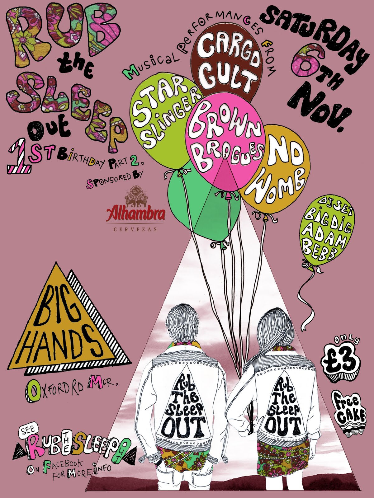
The boys at Rub the Sleep Out approached me again, this time they wanted a poster advertising their 1st birthday party. There are going to be four bands playing on the night so each band needed to appear on the poster. I decided to include my Rub the Sleep 'boy and girl' in the poster as this should help to attract the regulars who may recognise them from the main poster. The balloons seemed like an obvious choice given the celebratory tone of the night and gave me four convenient spaces to fit the names of the bands into.

First attempt at a design for the poster (below).


Detail of the balloons (below).

Final poster (below). I included the paisley fabric which also features in the main poster, again to keep some consistency and make sure that attendees recognise any future posters. The lilacy-plum colour in the background acted as a good base for the other brighter colours to stand out from.


You can read more about the event on Last FM here.

Tuesday, 12 October 2010

Mark Lanegan

Below is my Mark Lanegan poster in various stages of completion. Although I don't normally like to use found images of the musicians I've been making posters about I couldn't resist this photo as I knew it would make a fantastic drawing. It also really captures the utter coolness of this giant of a man.

Original photo (below) found somewhere on the net? Unfortunately I can't seem to find it anymore to link back, apologies to the photographer.


Drawing (below) made from the photograph. When working from a photo I try to work quite expressively and don't attempt to draw every part allowing for some negative space. This also helps as it allows some room for the all important text.


Drawing with some parts of the original photo collaged back into the drawing to provide some contrast (below).


Finished poster with textured layer in background to add 'grunge' (below).


Monday, 6 September 2010

Chew the Float Private View

I've been working at a slightly insane rate recently, what with teaching, writing essays for my Masters, poster commissions and making my work for the 'Chew the Float' exhibition at Victoria Baths. Thankfully I am starting to see the light and everything is finally coming together. Below are some photos of the exhibition including my entry which is a length of wooden bunting which reads 'Not Waving But Drowning'. The statement that went with my piece went as so:

'Victoria Baths inspired me to create something that recalled childhood memories of swimming at my own local baths in Salford. Unsurprisingly my most vivid memory is when I came close to drowning at the age of 7. Waving cockily to my Mum before diving into the deep end I found myself entangled in my rubber ring, trapped underwater, gasping for air. Luckily Mum was able to translate my SOS and saved me from a watery end. However, the experience left me with an overwhelming fear of water for many years.
'Not Waving but Drowning', a reference to the Stevie Smith poem, acts as a sign to both warn and celebrate. The warning goes out to others like my 7-year-old self, giddy with a false sense of invincibility, to take care, but the sign also celebrates overcoming fear to participate in the joys of swimming, an activity that thankfully no longer fills me with the sense of dread I felt as a child.'

My poster greeting visitors on their approach to the baths (below).


A 'hipstamatic' impression of my piece (below) courtesy of Nathan.


In close-up (below).


Some of my very talented friend's work (below).


Emma Baker


Andy Gornall


Rachael Barker


Matt Davies


Related Posts Plugin for WordPress, Blogger...