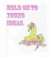
 The idea for the poster actually originated from one of my husband's doodles which I found lying around. I think it amuses him greatly when I find these drawings and proclaim them to be genius. Maybe it is an exaggeration but there is something about the way he sketches without thinking that always seems to result in a truly surreal outcome. When I found his little drawing of a dancing harlequin boy with crosses for eyes and a giant tear falling down his face I knew I could develop it into a poster for our band. Below are the results: first the original poster design, then the resulting prints in two colour ways. We also printed onto t-shirts and John showed us how to easily set up a similar arrangement at home so that we could print there.


No comments:
Post a Comment