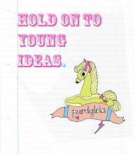
purdylola draws is where I keep my illustrations and archive the artists who inspire me. You can also find me here at Purdylola Loves for more general musings on art, music and fashion.

Wednesday, 28 April 2010

Grizzly Bear

I've just finished a poster commemorating the Grizzly Bear gig I went to at Manchester Cathedral last November. Originally I was going to use the watercolour (below) that I did based on a photograph of the band members. However, as much as possible I want to avoid using found images as I think it would be more interesting to create totally original responses.


With this in mind I thought about including an image of the cathedral as it's such a unique venue for a rock show so it made for a rather extraordinary gig. I hit on the idea of a grizzly bear climbing the cathedral tower King-Kong style fairly early on but it proved a bit too tricky so I settled for him grabbing onto one of the spires instead. Either way I'm quite happy with the results.

To create the image I used a similar technique to the Yeah Yeah Yeahs poster by using the pen tool in Illustrator to create shapes and build up each component of the poster. I quickly mocked up what I wanted on Photoshop and kept a jpeg in the background as a guideline of where things went in relation to each other. It's probably a bit small to appreciate on here but I tried to add more detail to the bear's face to contrast with the more simplistic shapes elsewhere, hopefully adding character.

Sunday, 25 April 2010

Yeah Yeah Yeahs

I have been spending a lot of time in my sketchbook recently, gathering images which might be relevant for the gig posters I plan to make such as album art work, on-stage photos, existing gig posters for the same bands etc. Whilst putting together these pages for the Yeah Yeah Yeahs I came up with an idea for the poster which is very much inspired by this crazy Navajo-esque poncho that Karen O wears regularly on stage. I thought that I could eventually create the bright neon colours and graphic shapes digitally in Illustrator.


First however I thought that i'd make something by hand so using some coloured card and a craft knife I put together the paper-cut below which is quite effective when the different coloured card is staggered a bit so that all the colours are visable at once.


I then made this drawing ready for scanning into Illustrator (below).


Once I had traced the image and converted it into a vector it immediately took on a new quality however I decided that if I was really going to exploit the possibilities of Illustrator I really ought to create a drawing using the software from scratch.


To give me something to work from I kept the original image of Karen on a layer so that I could refer back to it if needed (below).


Gradually I developed the poster adding in Nick and Brian as well as some text, all using the pen tool. As it was my first attempt I decided to keep all the shapes angular and not actually convert them into curves. This was partly because i really liked the effect it created and it seemed to suit the spiky vibe of the Yeah Yeah Yeahs music and partly because I'm not brave enough yet.


Final poster below. In an addmitedly unusual attack of perfectionism I realised that Nick and Brian needed to swap sides as Nick is always to the right of Karen when they perform on stage. Compositionally it also works much better now that Nick is pointing into the image rather than away. I also left the background blank so that I could print it out on different papers. It looks quite good on a cool grey colour.


Thursday, 22 April 2010

Adobe Illustrator

I've decided it's about time I learnt how to use Illustrator properly and create vector images like the ones in this advert for the Guardian below. Even though I use Photoshop all the time and have used Illustrator before at uni it was some years ago and I really need to refresh my memory. Apart from the obvious size/quality benefits of working with vectors rather than bitmaps there are obviously far more drawing possibilites available in Illustrator though at the moment the thought of how long it will take me to even break the surface turns my stomach. For a hands-on, collagey, messy technophobe who is bad at maths this is a big deal for me. Like this person on this website here said 'Illustrator is a geometry calculator where Photoshop is a blank canvas'. Well I know which I pick up most often, however the time for change has come. Wish me luck.

Tuesday, 20 April 2010

Mount Pleasant

Looking forward to the Mount Pleasant Exhibition which is also acting as the Official 'Sounds from the Other City' opening ceremony at Islington Mill in Salford on Friday 30th April. The exhibition promises to feature original posters, record covers, prints and illustrations by Manchester-based illustrators David Bailey and Lucy Jones also known as 'Mount Pleasant'. David's work in particular is the sort that you sub-consciously notice everywhere in bars, clubs and in the shops around Oldham Street without ever realising that it's by the same person. Fortunately David and Lucy have neatly arranged their excellent creations on a website here so now when I think I spy a Bailey, I can go there and check if I'm right.


David Bailey


Lucy Jones


Friday, 2 April 2010

New York

I'm currently suffering from inspiration overload. I'm not sure there is anywhere in the world more inspiring to a graphic artist than the Big Apple. This was my second time there and once again I saw every conceivable site, walked around loads of galleries, went to Staten Island and back, took hundreds of photographs and picked up tons of flyers, posters and books. The only disappointment was that we didn't get to see the Tim Burton retrospective at MOMA, the queues were literally around the corner every time we passed, however we did spend a lazy afternoon in the Metropolitan Museum of Art and saw a really interesting, albeit slightly less hyped exhibition called 'Playing with Pictures: The Art of Victorian Photocollage'. The exhibition featured the work of Victorian women who were collaging up a surreal-storm long before the avant-garde artists of the early twentieth century. In fact I enjoyed it so much I bought the rather expensive accompanying catalogue (which was in fact a very big heavy book) so that I could read up a bit more on this fascinating subject.

Below are just a few of my photographs from the trip.


Related Posts Plugin for WordPress, Blogger...